Does your UX meet up with the expectations of your clients?
Many SaaS disappoint customers when the reality of their UX doesn’t match the “wrapping” of their landing pages and product videos.
It’s disappointing for the SaaS too. You put all of that work and investment into attracting customers, you work them up to a purchase, only for them to churn early because your interface is too clunky or your app is generally awkward or inflexible to use.
How should you set up the right experience for your customers?
Set up the Right Expectations
You’ve probably had experiences in your own life where the actual experience didn’t match up to the expectations you were set up for, right? Like a pair of socks in a large box with brilliant wrapping, you were probably left underwhelmed (unless you really love socks!).
Quite simply, the marketing material you put out needs to match up with the actual experience those who sign up are going to get. If not, you will see churn from low-tier signups and on upgrades.
Sometimes SaaS will over-emphasize features which are only available on premium tiers in early marketing materials. Just make sure you’re giving fair treatment of what to expect at each level and that you show an accurate representation of UX. Don’t represent clean, logical design if the reality of their experience is going to be more like a complex Excel spreadsheet.
Have a Thorough Onboarding Process
Your onboarding process plays a huge role in how successfully clients feel comfortable with your app. If the transition to using your app is clunky or overwhelming, you’re more likely to see higher churn numbers, while if you’re able to ease them into using it and seeing value, you’re more likely to successfully retain clients.
Onboarding also plays a big part in setting those expectations. It’s about walking users through so that they see success from your app. As a Usability Geek post states: “the success of every business depends on aligning business goals with customer needs.”
By the end of onboarding, your users should be confident that they have made a purchase which meets their needs and allows them to achieve their goals. From a UX perspective, product workflow should make sense to them, answering; “I need to get something done, how should I do it?”
Know the Link Between UX and Customer Success
Process St talks about this point; you should improve user experience with customer success in mind. Specifically, they make the following points:
- If you can make it easier for your customers to interact with your app, they will achieve success more quickly, firmly and… long-lastingly.
- Users should be primed for success from the moment they discover your app. This means that they should know what to expect by reading your copy and seeing your screenshots. It means they should have great interactions with the sales team who should try and teach the users about every feature they’ll need.
- User experience — how it feels to use your app — should be optimized to make sure your users want to stick around, learn the new features, interact with your customer success and support staff.
If you successfully marry the UX with customer success, this is another point in favor of the retention of your clients.
UX Design Tips
The battle against churn begins with your UX. You want to design an app that creates interactions which are habit-forming. These might include sensory triggers, rewards, personalization and opportunities for commitment. These habit-forming interactions follow principles of behavioral engineering.
Furthermore, Jeluma Lai, UX lead at Zoho Books identifies the following design issues for SaaS applications:
- Layout – You need to consider the various devices and habits of users to put together a layout which makes sense.
- Product workflow – The less time it takes a user to complete a task they’d like to do, the more of a win for UX.
- Visual design – It’s not good enough for an app to simply work, customers expect a beautiful design now too, otherwise they probably won’t use it.
- Forms – These are always necessary so making them easier to use is a task for UX.
With these in mind, here are some UX tips for SaaS:
#1. Reduce form friction
You know what most people do when they see a form with 12 fields to fill out? They think “ugh” and run away. You’ve got to remember that you may have people filling out forms on a mobile device too — how clunky is it when there are multiple fields?
The simple solution is to reduce the number of fields you require for initial signup. Only ask for the minimum information that you really need to get people going.
#2. Reduce other friction points
There are actually a number of other ways by which SaaS create friction for customers with their processes. Here are a few to consider nixing or streamlining:
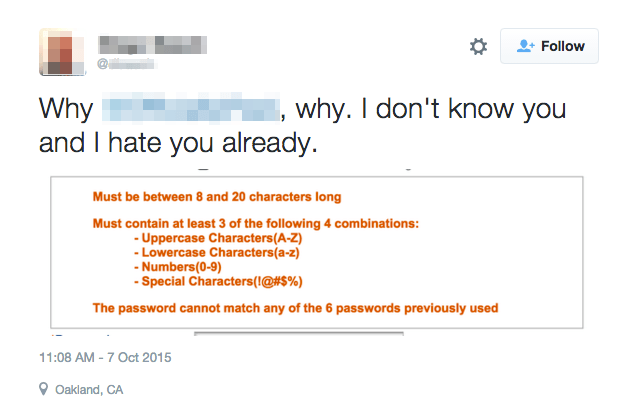
- Complex password rules. Chargebee wrote a good piece about this, highlighting how constraining users with your 17 rules for creating a password leads to password fatigue and frustration.

Source: Chargebee
- Forcing users to fully complete their profiles before they can use your app. Is this really necessary? Your users may well be fatigued already by the time they get through the list of prompts you have prepared for them.
- Creating a mandatory onboarding flow which a user must get through before they can use your software. Seriously, how well do you like it if you’re forced to do something when all you really want to do is get to the main point?
#3. Design for existing behaviors
Remember the story behind games such as Minesweeper? This was effectively an onboarding tool to get users used to the way Windows would work with a mouse. While of course you may have some new way of doing things included with your app, building off existing models of how people expect software to work will make for an easier transition.
#4. Contextualize everything
This was an important point raised by Jeluma Lai; good UX is logical and contextualized, with the experience seeming as linear as possible to the customer. This means that they shouldn’t be sent off to separate settings screens for “side tasks” in the process.
#5. Focus on your most common features
When it comes to UX and UI design, your most common features, those which the customer is initially coming to you for had better be impeccable. You might start with understanding exactly what those are — what unique problem/s are you solving and for who?
Knowing who your customer is and what they expect will help you to focus on the features which are most important rather than going down a tangential path on “nice to haves.” If I purchase your accounting app, yet it won’t integrate properly with my payment provider without me having to go to all sorts of extra trouble, how likely am I to stick around?
Final Thoughts
Setting up the right UX for your SaaS is critical when it comes to customer success and reducing churn, yet surprisingly, many SaaS seem to overlook UX as a determinant of success.
Good UX is about being customer-centred and ensuring that you deliver based on the expectations you set with customers. No one is happy when the experience doesn’t live up to the packaging!
Make UX a key focus in your SaaS along with those other important tasks such as onboarding and customer success. This will help you to keep churn down.

