So, we had the concept for the game pretty much nailed down. Now it was time to talk about the artwork. Tyler had been working in the background to figure out how the game should look.
Our Stunning branding is already pretty nautical. It’s a credit card with a life preserver around it. So Tyler decided that a nautical theme would work best, and he sent us this mood board for the game, based on his research.
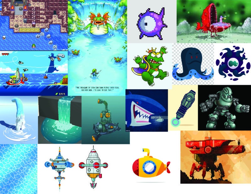
I’ve represented a few ideas here on this mood board. Based on your current website look, logo, and visual identity, I’ve gone with a nautical theme.
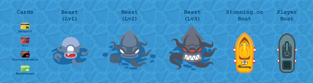
The game itself would be viewed from a top down perspective over an ocean with gentle waves. The churn beast I imagine as a pseudopod-type creature which devours the aforementioned payments. Notable characteristics include tentacles representing the area in which he pulls in payments, and a round, central mouth with sharp teeth that are revealed when he feeds.
The player will control a small boat that shoots at the payments/beast. The rendering of the base as well as the other game art elements I view as a combination of the bottom 3 ship designs on the moodboard. Simplistic coloring and shading— potentially with an outline.
So the beast would be an octopus/squid type creature, is that what you’re thinking?
It feels like the best fit for a nautical theme, plus I have a certain affection for cephalopods.
Would the perspective be like the top left picture where you’re kind of far above the water?
Possibly, perspective bumps up the illustration budget vs top down because you have to make more poses for things that can rotate. If it makes sense and looks good, we’ll probably go that route.
Would the credit cards be like little credit card fish that swim around?
I think I want to go pretty literal here and just have better illustrated credit cards as the art. I like the idea of them being “lost at sea”. We’ve saving them from where they don’t belong.
What are we shooting at them? Would it be simple, like a dot or will it be more like a cannonball, or life preserver, or starfish (throwing stars, haha)
While the idea of flinging starfish is hilarious, I still haven’t quite nailed down when the projectiles will look like. They will certainly be more than dots as they are now. I liked the idea of life rings, but I think it would be best if they were iconographic of the dunning effect. So Email Icon, Super Email Icon, SMS Icon, In-App, etc.
That all sounds awesome, I’m super excited to see the final product!
Then, later on, Tyler shared how the churn beast is going to look:
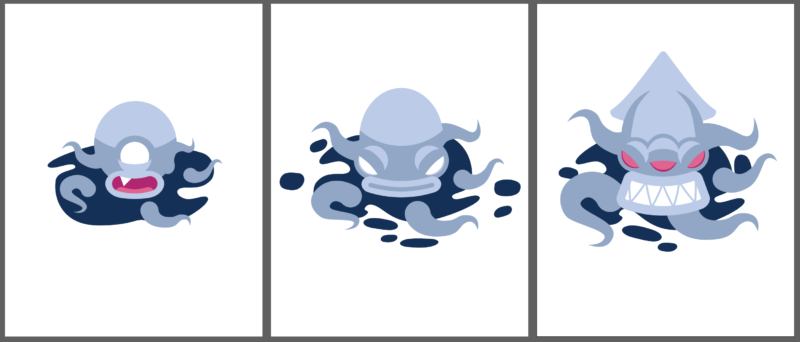
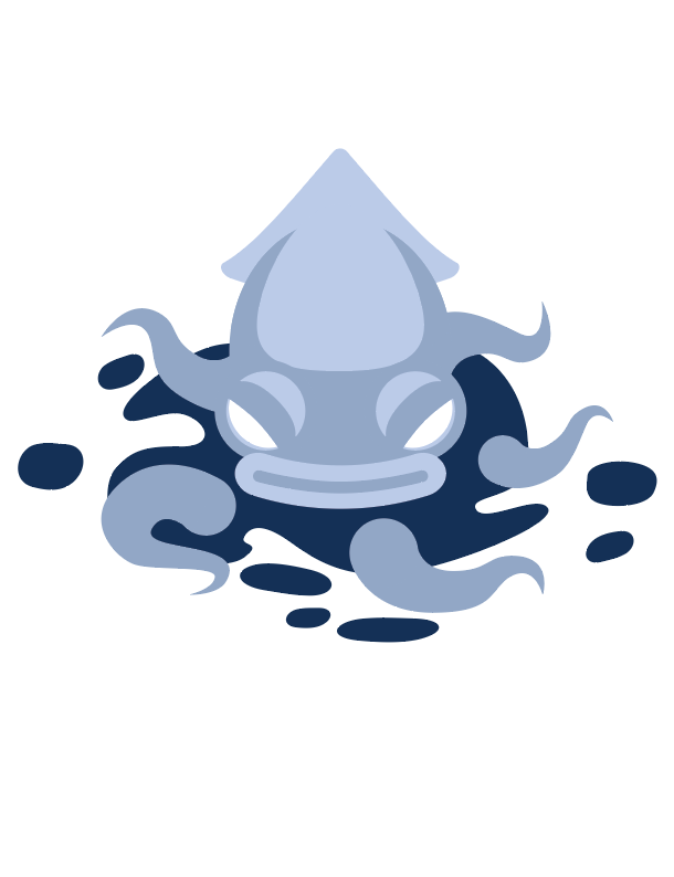
Hi all, here is the look of the churn beast. Colors aren’t final, but this is the kraken-type creature that that will float around and eat the payments. Let me know how you feel about his current aesthetic— Thanks!
i love the first and 3rd ones, and how there’s a clear progression between them. something about the second one is bugging me. i think it’s the shape of the head, it feels like it’s an angry egg, haha
I think these are great! Maybe if his head was a little more pointed in the middle one he would feel less like an angry egg? I like how it has one eye, then two, then three!
a bit of a tweak on the middle one. He’s upgraded from angry egg to slightly pointy:
i like this a lot better, thanks tyler!