Scott decided to get some eyes on our failed payments game, to see if anyone found it confusing and if it was fun to play, among other things.
Afternoon all. Just a heads up that I am going to share this tonight at a Philly Game Mechanics playtest meetup on discord. I’m excited to get some broad feedback. I just wanted to clear it with you folks that it’s okay to share.
yep! that’s fine with me. thanks for asking. getting more eyes on it will ensure that it’s fun to play!
Great, I look forward to getting some feedback. I’ll check in after and let you know how it went.
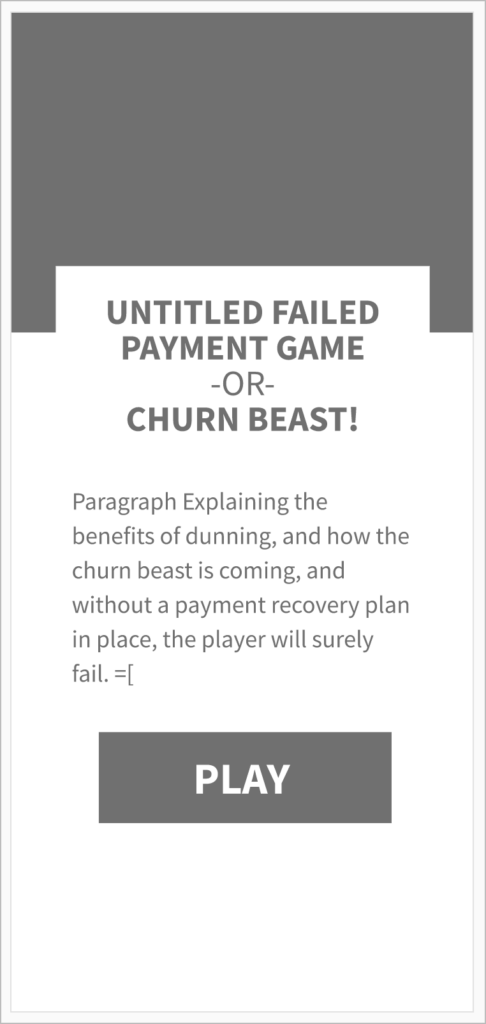
Hey folks, I wanted to share over this little user flow prototype I made, mainly as a tool to start thinking about copy needs. There is a title screen, and end screen, and a screen between every level.
I’m currently wrapping up the full game prototype with 5 levels.
I haven’t talk too much about the gameplay testing, but I do think it went well the other day. I think the main takeaway was that we need to be really communicable about what the things are and how they work. I didn’t get to guide the players very much on their playthroughs, (there was a hiccup where my explanation was not able to be read), so there was a bit of confusion.
So I’m hoping after I get some explainers in between all the levels to set their expectations, it’ll be more quickly understood. That, and color alone isn’t great for the payments. Seeing these pain points early are helpful in designing our assets.
Here’s the prototype that Scott made for us. It’s was cool to have a mockup that we could step through, that showed the different screens that we’d need.

